I often get complimented on the appearance of my website.
And I sure hope the recent redesign didn’t put that in jeopardy!
But in all seriousness, having a nice website reflects on you as a business owner.
You see, if you can’t be bothered spending the time and care on your website, then you may give off the impression your services and products will also be crappy.
Well, today you are in luck because I am going to share my way of creating awesome webpages.
I am going to explain the two components that make this possible.
You ready? Let’s go!
It doesn’t have to be complicated
Some people will assume designing web pages is a complicated process. While it does take skill, there is a science to the design.
It all comes down to two main things.
Techniques: When designing web pages, content should come first. Design should come later. But both are equally important and I’ll show you how to think about each.
Tools: It’s hard to create a nice site if you have improper tools. It took me years to work this out. And free doesn’t necessarily mean good. Sometimes you just have to invest in the tools.
Before I go into detail, I’d like to invite you to grab your website setup checklist. Because we both know you need to setup your website well before you think about designing it.
You can grab it here:
[fl_builder_insert_layout id=\”13024\”]
So…
Let’s start at the top. With techniques.
Techniques
Let’s look at both content and design under the umbrella of techniques.
Content
The very first thing you should do is to know your content, the goals for that content and the call to action.
Some people will focus on the design if they have the tools. This is a mistake. If you start purely with design, you run the risk of losing your message.
Here are some things to keep in mind when discussing content:
- What type of page is this? Your homepage? An internal page or a direct response landing page?
- Where do your visitors come from when visiting this page? For example, an about page generally attracts visitors from the homepage or from those doing a direct search of you. They are evaluating you. Whereas a landing page is generally attracting visitors from an ad and more disruptive.
- What is the objective of the page. How will it push the relationship forward? What impression of your business is it going to give?
- And what is the call to action? What are they meant to do for you after reading this page?
Here’s a tip. Try and get inside the head of your prospects and answer the questions they would have in the right sequence. This includes follow up questions.
That’s just a brief introduction to content…
Now we can move on to design and see how to bring the two together.
Design
Although content should come first in the process, design is just as equally important.
Don’t let anyone else tell you otherwise.
I’ve had the lecture from gurus that say your content is all that should matter. If that were the case, then why do Facebook posts with images attract more attention than those without?
We are like Blue Jays. Attracted to shiny things.
So I’m going to throw some glitter your way now 😉
Just keep in mind, design is not necessarily a linear process.
Nonetheless, I’ll do my best to describe the essential elements.
Colours & Typography
Why do so many free themes from WordPress org look amateurish? Mostly it’s because of weak typography.
For those of you who don’t know what this means, Typography is the art of getting your font right. It includes aspects such as font family, font size, line spacing and more.
Font matters.
And colour? Naturally colour matters too.
These two items – font and colour – are global. That means that each page you create inherits them. They should be consistent and in line with your brand.
Here’s some great websites to help you choose fonts and colours:
Cool? Okay let’s look at some more page centric elements now.
The Hero Unit
The hero unit is the large area section that appears on your homepage and sometimes inner pages.
It tells the viewer what you do and why you are different. This is important because it helps the prospect know they are in the right place.
Let’s say your prospect clicked on a link from your facebook page back to your homepage. You’d want to a) reassure him he’s in the right place and b) let him know what to expect.
See my own hero unit for this website which has changed by now.

You’ll find it mentions what I do. Affordable Websites.
The reason why you should be interested, or the unique selling point, is that you only pay for what you need. And there are no contracts to hold you barred.
You’ll also notice I have a Call to Action button in red. That’s a good idea to have one.
Yes, some prospects will want more information and those will scroll down the page to read further.
But for those in a rush, or who already know about you, have a CTA (call to action) in the hero area.
So if somebody was coming from my facebook page here https://www.facebook.com/moawm/ they would have expectations in mind.
I’ll be the first to admit my FB page and website currently have a disconnect. Which is why it’s important to get your messaging right.
The hero unit gives you this opportunity.
Side Note: I have recently rebranded since this post. At present I am not focusing on templated websites for various niches but rather custom websites. If you want more information about getting a templated website feel free to contact me.
Now let’s move on to callouts.
Callouts
Another web design element are what are known as callouts. These have become popular in recent time.

Above is a set of callouts from http://littlemissuseful.com/.
You’ll notice this design concept gives a clear bird’s eye view of her services grid.
Likewise, you can also have callouts in the form of features on multiple rows as I’d originally done on my care plans page.

Of course, there’s so many different design patterns and concepts it’s impossible to list them all.
That’s why I’m going to mention some tools that will help you build your site using various design patterns.
Let’s get to it…
The Tools
The best tools for creating awesome design are page building tools. I’ll start first by listing them here then we’ll explain each one in turn.
Beaver Builder
This is a great page building tool for creating your homepage and inner pages.
You can easily create the design elements I described above. For example, the hero unit was created using a full width background effect with simple text and image inside.
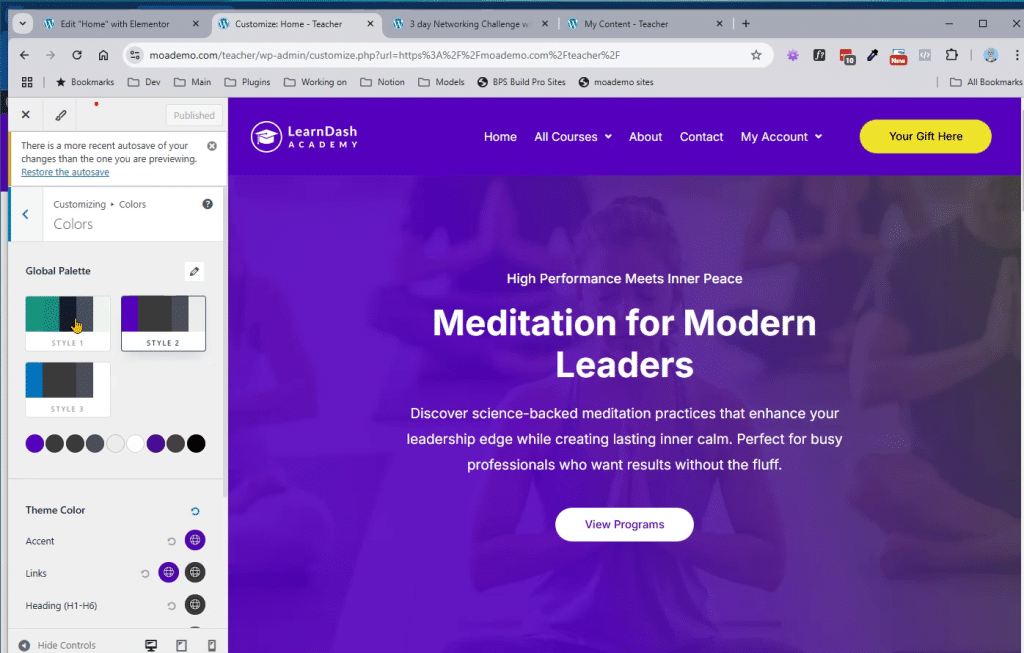
I love how you can choose your colour palette and manipulate colours on the fly through point and click.
But, one limitation of Beaver Builder is the inability to create columns within columns.
This is generally not an issue but sometimes I would like to separate the right image from the elements on the left.
But with all the modules available, this shouldn’t be an issue.
Yes, Beaver Builder does have a free version but you’ll want to invest in the paid version for the templates and modules it offers.
Powerpack and Ultimate Beaver
These are very similar addons for Beaver Builder. They add more flexibility to the already powerful plugin.
Aside from new modules, they also have improved versions of the modules already included with the base pack.
Both of these plugins also have free version on the WordPress.org repository and you could get away with using all 3 of the free versions.
Lastly, you can create popups and exit intents with these addon packs but I am beginning to see that Thrive Themes is a better solution for marketing components.
So let’s look at Thrive Themes now.
Thrive Themes
Thrive Themes is an extremely powerful set of tools. While they have a newer and improved page builder, I only really use their page builder for landing pages.
I use Beaver Builder for the regular page designs.
So yes, there is room for both plugins as Kim Doyal of WP Chick indicated on her blog post.
But Thrive is so much more than just a landing page builder. It has tools for building optin boxes/forms, marketing quizzes and so much more.
There’s absolutely no reason why you can’t use both Beaver and Thrive.
Other Tools
I use Genesis as my theme of choice because of its flexibility and the plugins available for it.
It also integrates with Beaver Builder’s Themer plugin.
This allows you to modify the header and footer of the theme by creating a page builder version.
It still retains the microdata too such as WPHeader and WPFooter.
You’ll also need Genesis Dambuster if you want edge to edge effects when using Beaver Builder.
Thrive Themes on the other hand hijacks the entire page removing its header and footer. This is cool for building landing pages.
However, one big disadvantage of Thrive Themes Landing Page Builder is that it only works on pages and not custom post types.
So creating a great webpage is easy when you have the right tools mixed with great design and content techniques.
Phew, that was a lot of ground to cover! If you feel overwhelmed, I suggest downloading my plugin guide or replying to this post. All questions welcome!


